Practical tips for using scales in surveys at work without needing to be a statistician
One day, a couple of years ago, an HR director at the company where I was working decided to do a feedback survey for all employees. It was a simple questionnaire where you mark all the things you like or dislike about our company and their team, answer a couple of questions, and rate some things. I'm not a fan of such a formal method of receiving feedback, but that's okay. Among other things, the questionnaire had the following question:
Rate on a scale of 1 to 10: How often do you receive feedback about your work from your team lead?
0 (not at all) 1 2 3 4 5 6 7 8 9 10 (often)
Okay, this is definitely not a precise question about the frequency of feedback, but more about feelings. With it, we might do a rough check-up on our employees to see if they are satisfied with the amount of feedback they receive or not. But then, I asked:
"Why do we need a scale of 10 for that? Let's do yes/no/"don't know" or maybe a 5-point scale?'
I got an answer that immediately triggered all the warning signs:
"We will do that for precision, to compare between different teams."
Let's break down what's wrong with using a 10-point scale first, and then discuss what could be improved and why one should care about it.
What is "mid"
This is quite obvious. Different people will find their "average" in different places; for many, it will be around 7, for some it will be 5, or even 4. It definitely doesn't help that no references were provided. By the way, the true average of the scale is 5.5, which isn't even on the scale in the first place.
To illustrate this, take a look at the IMDb's movie rating distribution:

The average for this 1 - 10 scale is 6.3.
The discrepancies between different people's averages will, well, average out across many responses, but when we're talking about comparing responses between multiple teams of 5 or 10 people each, the averages simply don't have time to converge.
Oh, and what different people consider "mid" even before assessing it numerically is also different, just in case.
What is distance?
A difference of 1 point on a scale will mean something different for every person. Because of that (and a few other things), you simply cannot compare values on it numerically, nor can you take an average. That is an issue even if you provide a clear reference for each point; the scale is inherently vague.
The averages on such scales can be somewhat comparable if you compare them by groups of, let's say, 100 answers. Hopefully, if you also have a low variance, i.e., low "overlap" between these distributions. But in practice, no one will be looking at that or bothering with such thorough analysis. It is not really needed, as I will show later.
Precision
Increasing the number of points doesn't help either. It does not increase precision. The HR from my example above was just lowering the signal-to-noise ratio while simultaneously fooling themselves into believing that differences in numbers correspond with some real effects.
The thing to understand is that no matter what kind of scale you choose, it won't change your precision. A scale cannot magically influence how people describe their feelings and opinions; these things are abstract. Well, I'm not a survey specialist, so I can't say that with confidence, but I can talk about managers like me implementing such surveys in practice, cutting corners, being lazy, etc. In that context, there are definitely more effective things to do than to play with numbers.
For example, we can just accept the vagueness of our data and work around it. If you have time, you can get more precise by writing different questions or adding a couple more of them. But after you've collected the results, you should analyze them with the understanding that the data is qualitative, it is just labels without any numerical value, like a bunch of emojis under a post on social media.
A scale made from emojis 😡😤😐🙂😍
To get to practical advice, I suggest using a much simpler scale when asking about people's feelings and opinions:
It's a Likert scale; you've definitely seen it before. It goes like this:
😡 - [strongly disagree]
😤 - [somewhat disagree]
😐 - [neither agree nor disagree]
🙂 - [somewhat agree]
😍 - [strongly agree]
The labels could be just anything to make the Likert scale into just an arbitrary ordinal 5-point scale. From my example with the frequency of feedback from a team lead, they could be like this:
- Never
- In the last 3 months
- Once or twice a month
- Every week
- Daily
It is a simple 5-point scale, but it's not numbers like 1 - 5. It's important not to impose any quantitative meaning on the scale itself. It's all about the labels that your respondents are selecting and how much of each label you receive from each group.
Such a scale will not only save you from common mistakes in analyzing and presenting the data, but it will actually provide greater insight! Because now you're not only gauging something; you're actually receiving some new information you did not have before.
For simpler questions, even a binary or ternary scale is good:
- Binary: "yes" / "no"
- Ternary: "yes" / "don't know" / "no"
Right tool for the job
Here is an example: Consider two groups of students taking lessons from two teachers. After the exam, the results for these two groups were as follows:
- Average score: 60 out of 100
- Average score: 65 out of 100
Which teacher did a better job teaching their group?
Answer
The actual results were:
- [78, 60, 52, 50], mean: 60, min: 50
- [80, 75, 70, 35], mean: 65, min: 35
We might say the first group did okay, but that student who scored 35 in the second group definitely needs our attention. Either the teacher overlooked them, or they might just be an outlier.
Averaging results is not only a lazy way to conduct analysis, but it also doesn't apply to ordinal data, like emojis and labels from our version of the Likert scale. However, you can calculate other metrics — often even simpler ones, to gain insights:
- Number of responses (frequency) for each label — this is the most useful metric. It's versatile and can be presented in a straightforward and visual way, as I'll demonstrate shortly. For example, you could say, "Twice as many users indicated they would recommend product A compared to product B," instead of saying, "Responses in our product A questionnaire were 1.56 points above the average from product B." The first option sounds much better, doesn’t it?
- Minimum and maximum values — these are fine to calculate and compare. You could, for instance, place a bar at the minimum value that you consider indicative of a group's success in what you're measuring. These are good metrics for identifying outliers and quickly directing attention to important aspects.
Less effective metrics:
- Median value — technically, it's okay to calculate and compare between different groups, but be careful. Median values can yield very noisy results when there aren't many labels (like 3 or 5) and/or when there's high variance in responses within a group. Additionally, the built-in interpolation in software like Google Sheets or Microsoft Excel might create a false impression of precision; in reality, those small discrepancies in numbers are just noise.
- Average value — technically not okay to calculate and compare between different groups, as it can easily be skewed by differences in judgment between people. At the same time, it obscures important details like variance.
Average in a different dimension
This is a trick often used in psychological surveys. If you need a more precise numerical assessment for a particular question, break it down into multiple similar questions that approach the same topic from different angles. For example:
- Do you feel your team lead communicates effectively about your performance?
- Does your team lead provide enough input on how you're doing?
- Do you think your team lead keeps you informed about your progress?
- Do you feel your team lead gives you feedback often enough?
- Are you satisfied with how regularly your team lead checks in on your work?
You use the exact same scale for each question, whether it's Likert or ternary, and then assign numeric values to the answers, such as -2, -1, 0, 1, 2. After that, average the values across these questions for each respondent, rather than across multiple respondents. In the end, you'll obtain a somewhat more precise numeric assessment of the topic you've inquired about.
The second trick is to break down the concept in question into its components, much like Airbnb does when you review a place:
- Rate the house's cleanliness
- Rate its location
- How accurate was the description?
- How smooth was check-in?
- How well did the host communicate?
- Was it value for the money?
Again, use the same scale for each question, assign numeric values, and average separately for each respondent. This way, you not only get a numeric estimate for the overall experience but can also delve a bit deeper into its details.
In both cases, averaging these values between different respondents must still be approached with great caution and understanding.
Presentation
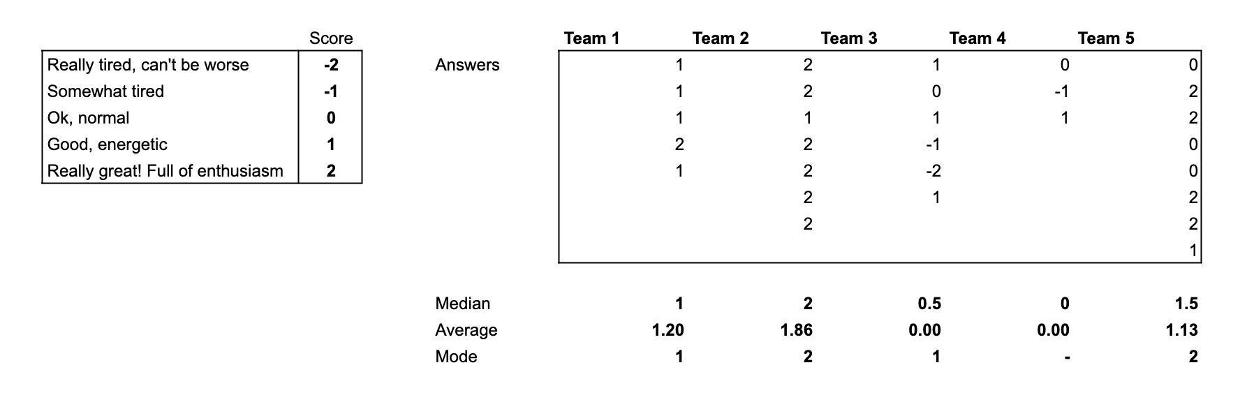
Imagine we've conducted a survey among different teams in our company, asking how they feel today. The results we received were as follows:

We used a Likert scale and gathered all the data, but analyzing it in this form is definitely challenging.
When we tried to pull some statistics from the data, we discovered that Team 3 and Team 4 feel the worst based on both average and median scores. But where exactly should we focus our improvement efforts first? Additionally, how does Team 5 compare to Team 1? Do either of them need our attention?
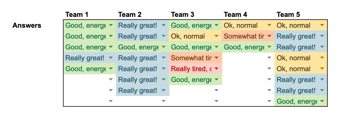
Let’s try to present the data in a different way now.

Or you can make it a bit more stylish!

Okay, that's better! It takes up less space, and the colors illustrate the data much more effectively than raw numbers. We’re now comparing not distinct metrics, but frequencies of labels present in the data just by looking at it. A row might appear more blue, orange, or red, making it much easier to comprehend. It's clear now that the 5th respondent in Team 3 needs our special attention.
While this format is an improvement, it’s still somewhat limited in what we can do with it. For instance, if we want to examine these results for each team separately, it becomes challenging to see how each team compares to the others in isolation, which might raise unnecessary questions.
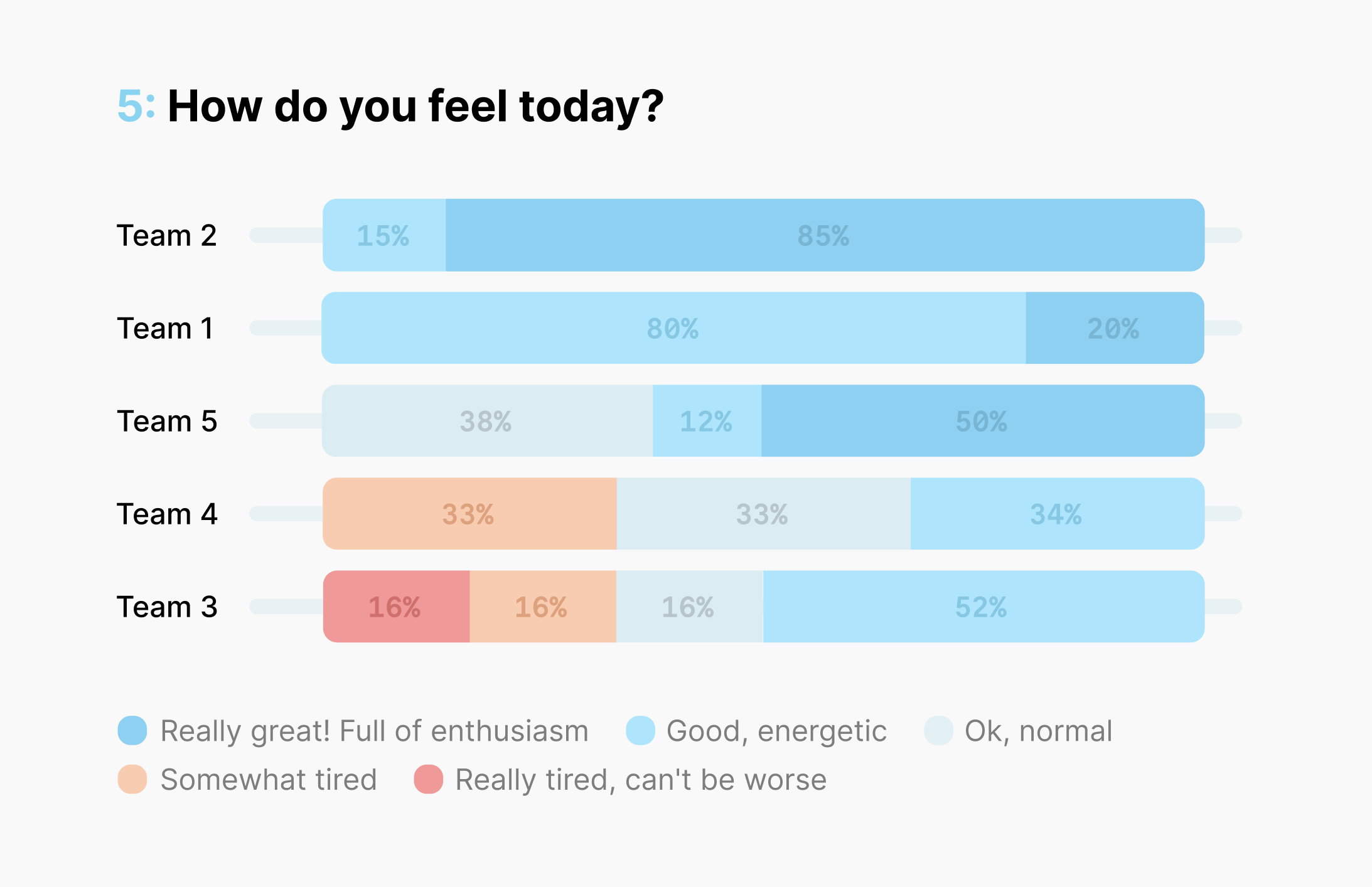
Let’s try one more approach.

Okay, that might be overkill for such a simple survey, but it certainly feels like it can't get more illustrative than this. We're now seeing the exact frequency of each response, allowing us to compare them between teams or between answers within a team, all at a glance and with minimal mental overhead. We can even assess the averages just by looking at how high or low each team is positioned on the dashboard.
Now, we can hand off each team their corresponding chart, enabling them to clearly see all the important details and compare themselves with others. If you've made some improvements and conducted a second survey later, comparing the results would be just as easy.
I hope this example has convinced you to move beyond just using tables of numbers, metrics, and statistics. Instead, consider going the extra mile with colors and charts, so everyone can grasp the big picture at first glance without needing to trust your analysis or question your accuracy.
Why care?
First, by using the right scale and the appropriate tools for analysis, you're freeing up so much time that would otherwise be consumed by excessive communication, questions, and explanations to the respondents. Likert scales are simply easier to understand. They are designed for imprecise and vague concepts, so it doesn't really matter how exactly people answered; what matters in the end is the big picture.
Second, if you work in a mid to high-level management position, sensitive topics and questions will inevitably arise. Some people may fall behind, while others will argue about everything if given the chance. It's better to have a solid foundation in such circumstances, using simpler and more obvious methods that are harder to dispute.
Third, it's much easier to make decisions (and advocate for them) when you have clear, evident, and transparent data at your disposal, allowing you to first embrace and then overcome its inherent vagueness and imprecision.
Further reading
- Likert scale
- 4 ways to visualize Likert Scales
- Level of measurement
- Nominal, ordinal, interval and ratio scales
- Analyzing likert data
- Ordinal data
- Net promoter score a popular 1-10 metric to be extra careful with, Advocacy Index is an improvement
- IMDB Movie Ratings
P.S. All of the above cannot be used for voting or selecting options; that's a whole different can of worms.
Questions asked:
- How to conduct an HR survey?
- What scale to use for an online survey?
- What is a Likert scale?
- Why 10 point scale is bad?
- Why frequency is more useful than average or median?
- How to present survey results visually?

